“Good ideas and information are necessary conditions for an effective presentation. Design also matters. But design is not about dazzle, sizzle, or slickness. Design is about clarity, evidence, engagement, and story. If the content has structure, if it’s true and honest and designed with the audience (or end user) in mind, then chances are it will be an attractive design as well.”
Garr Raynolds – Presentation Zen
This quote from the last paragraphs of Raynold’s Presentation Zen book has stayed with me since I read his book a while back. “Who am I presenting to?” and “What do I want the audience to take away?” are the two questions I ask myself before I start planning a presentation, as they will help me determine what I need to communicate and how am I going to do it. I am by no means a visual presentation guru, but I try my best to avoid extensive, word-laden presentations. I tend to use lots of images and some carefully chosen written text, keeping to a clean, consistent theme. This all sounds great, but when pressed for time (what, a teacher pressed for time?) it is easy to forget about this in benefit of getting the job done. This is exactly what happened when I created the presentation below. This presentation was directed at the Grade 6 students and the purpose was to introduce them to our upcoming camp.
These are the different aspects I would improve of this presentation:
Story
This presentation has no story to it. It is simply a collection of facts and images around Grade 6 camp. I would rehaul this presentation by structuring it around the students themselves going on camp. I would use “you” to address the audience directly and present each piece of information as we move from one item of the camp itinerary to the next. In my original presentation, I had some photographs that showed some of the activities and locations that we will visit during our camp and the camp itinerary. Instead, I would like the presentation to visually follow their itinerary day by day and finish with the behaviour expectations. In this way, the presentation will resemble a narration of what a student would see and do every day during camp.
Theme
Although the theme of the original presentation is clean and consistent throughout, I have to say it is a bit bland. I like that it is not visually overwhelming, so I would like to keep that, but I would perhaps choose a more lively background colour within the “earth colours” theme to maintain the connection to camp.
Images and Video
This the aspect of the presentation that I feel needs a lot of improvement. The images are all in placeholders with no frame (the video has a frame). The images are also small and only take up a small part of the slide, leaving a lot of unused space given that there is not much text either. For this reason, I would make the images cover the whole slide and I will position the text in an area of the image that allows it to be clearly visible. This means that I will have to go over all the photographs and change some for ones that will allow me to do this. Another alteration would be to move the video to the end of the presentation, as it will disrupt the “story” if I left it where it is right now.
Fonts
I used Avenir throughout the whole presentation, and the only variation was in size and thickness. I like Avenir as it is a sans-serif font, making the text very clean and easy to read. To improve, I would find another font that pairs well with Avenir to differentiate between headings and information, to help the audience follow the presentation.
Although there are lots of modifications needed for this presentation to be better designed, I am actually looking forward to making the changes and presenting it to the students. I am curious about how much of a difference I will see in the students’ reactions compared to the reactions I saw this year with the original presentation. Sadly, I will have to wait until next year to find out.
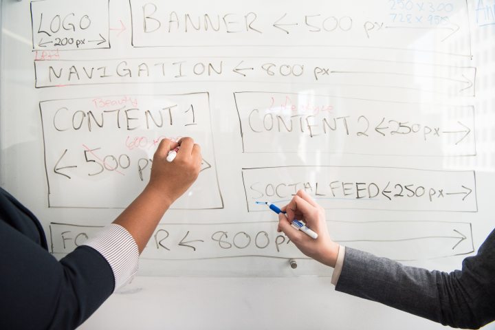
Featured image by Christina Morillo on Pexels.
It is so interesting to read your reflection and think about how much of a difference your updates would make. As I was watching the presentation my thoughts were, this isn’t bad, seems to be on point, they are 6th grade and they need to know what is happening. But I really wasn’t giving your audience they credit they deserved. your improvements will lead to a more engaged audience which will hopefully lead to some important excitement and enthusiasm build up for the trip itself!
I am impressed at the level of detail in your analysis of your presentation. Going so far to think about the text and the impact of its size and shape is clearly reaching the goals of this course. I really enjoy the use of images and I imagine that your students enjoy seeing their peers from the year before. The image of the head poking out of the tent is priceless.
LikeLike